Proposal dashboard

Bem Promotora

A central dashboard for agents to track payroll loan proposals, resolve pending issues, and manage each customer journey with greater clarity.

Year

2025 - 2026

Client

Bem Promotora

Paper

Solo Product Designer

Categories

Discovery, research, UX Writing, Artificial Intelligence

Impact and scenario

+100k sessions per month

Used to support the layout decision

Increase the quality perceived by users

100% of the messages linked to BemWeb standardized by the Product and UX Writing area and implemented by the Development team. ✅

INSS Fraud

In 2025, the Comptroller General of the Union began investigating an operation against INSS fraud, dubbed Operation No Discount. Thus, shaking up an INSS payroll loan company.

+100k sessions per month

Used to support the layout decision

Increase the quality perceived by users

100% of the messages linked to BemWeb standardized by the Product and UX Writing area and implemented by the Development team. ✅

INSS Fraud

In 2025, the Comptroller General of the Union began investigating an operation against INSS fraud, dubbed Operation No Discount. Thus, shaking up an INSS payroll loan company.

Context

A unique space to follow what moves each proposal.

The proposals dashboard brings together proposals generated from both the legacy and modernized systems, pending entries, and critical information so that agents can act with confidence, without wasting time switching between workflows.

The proposals dashboard brings together proposals generated from both the legacy and modernized systems, pending entries, and critical information so that agents can act with confidence, without wasting time switching between workflows.

Proposal dashboard

Proposal dashboard

Context

A unique space to follow what moves each proposal.

The proposals dashboard brings together proposals generated from both the legacy and modernized systems, pending entries, and critical information so that agents can act with confidence, without wasting time switching between workflows.

Users

It serves four profiles with distinct needs:

Data Entry Clerks

enter and track their proposals

Data Entry Clerks

enter and track their proposals

Store supervisors

view their typings and those of the team

Store supervisors

view their typings and those of the team

Managers and superintendents

follow on a broader level

Managers and superintendents

follow on a broader level

Client

who feels the effect on the speed of service

Client

who feels the effect on the speed of service

Discovery

Understanding who uses the dashboard was the starting point

In 2025, we conducted a survey to measure satisfaction with the dashboard. The result: NPS of 35.2 with 54 respondents, almost a quarter of them detractors, in a tool that is the screen where the agent spends their entire shift.

The survey gathered agents, supervisors, leadership, and clients to reveal the critical paths of the operation, points of concern, and opportunities for improvement.

In 2025, we conducted a survey to measure satisfaction with the dashboard. The result: NPS of 35.2 with 54 respondents, almost a quarter of them detractors, in a tool that is the screen where the agent spends their entire shift.

The survey gathered agents, supervisors, leadership, and clients to reveal the critical paths of the operation, points of concern, and opportunities for improvement.

NPS Distribution 2025 (%)
0
12
24
36
48
60
Detractors
Neutrals
Promoters

Reading both sides of the survey together, the contradiction becomes clear. Among the positive points, the dashboard is described as easy to understand, dynamic, with fast search, and a short learning curve. Among the areas for improvement, it freezes, displays outdated data, and generates insecurity when changing banking information.

In other words: usability was solved. What was missing was the user trusting that what they see on the screen is the truth, and feeling in control when acting on a proposal.

Two of these points were explained when cross-referenced with behavioral data. The request for a "more compact" screen was not an aesthetic preference: 46.04% of sessions in 2025 (226,872) occurred on screens of 1366px or smaller, a proportion that remained steady in 2026 at 45.45% (198,699 sessions).

Reading both sides of the survey together, the contradiction becomes clear. Among the positive points, the dashboard is described as easy to understand, dynamic, with fast search, and a short learning curve. Among the areas for improvement, it freezes, displays outdated data, and generates insecurity when changing banking information.

In other words: usability was solved. What was missing was the user trusting that what they see on the screen is the truth, and feeling in control when acting on a proposal.

Two of these points were explained when cross-referenced with behavioral data. The request for a "more compact" screen was not an aesthetic preference: 46.04% of sessions in 2025 (226,872) occurred on screens of 1366px or smaller, a proportion that remained steady in 2026 at 45.45% (198,699 sessions).

Pros

promoters 60%

  • Easy to understand, dynamic dashboard with clear information

  • Speeds up work by quickly showing what is pending

  • Good and fast search

  • Easy-to-learn tool with good access

Points of improvement

detractors 24%

  • System perceived as unstable, with crashes and sometimes outdated data

  • Confusing when adjusting a proposal; requested to be more compact

  • Changing bank details directly is perceived as risky

  • Difficulty knowing what to do regarding the proposal

  • Lack of agent search functionality

Quote

"Keeping the listening cycle running every six months is what allowed us to treat NPS as a symptom, not a verdict."

Product Owner

Investigation

Four listening sources

NPS indicates the temperature, not the cause. To find the cause, I crossed the survey with the listening channels we already kept running on a continuous basis.

Clarity semi-annual report

Every six months, Microsoft Clarity data is turned into an improvement report, not only for the Panel, but also for Login, Dashboard, and New Typing. Each page goes through the same analysis: rage and dead clicks, heatmaps, smart events, and reading session recordings. At the end of each section, the problem and suggested improvement are entered into an action table.

Time by status in Power BI

Analysis of how long each proposal remains stuck in each status, separating the perception of slowness from the actual bottleneck in the flow.

Qualitative listening

Usability observations, conversations, and feedback gathered from corbans and the commercial support team — those who receive the queries before they turn into formal complaints.

Interaction tracking

Throughout the project, tags were added within each interaction, so that interpreting the behavior did not depend on analyzing recordings.

BI and Clarity observability dashboards.

BI and Clarity observability dashboards.

The turnaround

Data-driven improvements, insight, and real-world usage

The research generated more opportunities than execution capacity: layout for smaller screens, failed submissions that do not generate proposals, filtering by agent and by month, onboarding for new users, single-screen consolidation, personalization, AI in the creation process, and a proactive assistant.

The cut-off criteria were: problem reach (how many users it touches), validation cost (can we test it before building it), and technical dependency, as part of the freezing complaints were due to platform instability, out of design scope, and needed to be addressed by engineering in parallel rather than being masked in the interface.

The research generated more opportunities than execution capacity: layout for smaller screens, failed submissions that do not generate proposals, filtering by agent and by month, onboarding for new users, single-screen consolidation, personalization, AI in the creation process, and a proactive assistant.

The cut-off criteria were: problem reach (how many users it touches), validation cost (can we test it before building it), and technical dependency, as part of the freezing complaints were due to platform instability, out of design scope, and needed to be addressed by engineering in parallel rather than being masked in the interface.

Decision 1

Agent Levels with fake door

Decision 1

Agent Levels with fake door

Discarded alternative

Build the complete gamification mechanics with levels, milestones, and a custom filter, and only then measure if the agents would engage with it.

Build the complete gamification mechanics with levels, milestones, and a custom filter, and only then measure if the agents would engage with it.

Chosen path

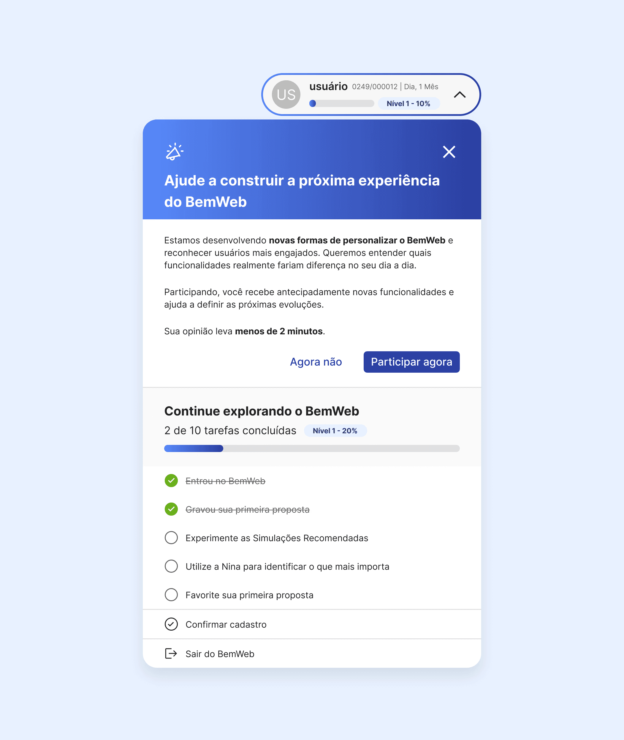
Test with a fake door in the user's account area, measuring real interest before investing time and development. The levels go from initial, at launch, up to the fourth, which unlocks a custom filter on the Home and Dashboard. If nobody clicks, the hypothesis dies cheap.

Test with a fake door in the user's account area, measuring real interest before investing time and development. The levels go from initial, at launch, up to the fourth, which unlocks a custom filter on the Home and Dashboard. If nobody clicks, the hypothesis dies cheap.

Fake door test conducted to validate a new feature.

Fake door test conducted to validate a new feature.

Decision 2

Nina+, virtual assistant

Decision 2

Nina+, virtual assistant

Nina+ applies artificial intelligence as a perception tool to flag users who need attention.

Nina+ applies artificial intelligence as a perception tool to flag users who need attention.

The virtual assistant Nina, who helps agents and consultants, appears on the Proposals panel, home screen, and when finishing a typing task selected to be featured.

The virtual assistant Nina, who helps agents and consultants, appears on the Proposals panel, home screen, and when finishing a typing task selected to be featured.

Decision 3

Layout for smaller screens

Decision 3

Layout for smaller screens

Discarded alternative

Treat the request for a more compact screen as a subjective preference and resolve it with minor spacing adjustments.

Treat the request for a more compact screen as a subjective preference and resolve it with minor spacing adjustments.

Chosen path

Bring 226,872 sessions to the table and treat 1366px as the product's reference resolution, not as an exception. Data of this scale ends debates about personal taste and turns the decision into a requirement.

Bring 226,872 sessions to the table and treat 1366px as the product's reference resolution, not as an exception. Data of this scale ends debates about personal taste and turns the decision into a requirement.

Screen size changes.

Screen size changes.

Decision 4

Onboarding "New here?"

Decision 4

Onboarding "New here?"

Guided flow to introduce the main features to a new Dashboard user, with actions such as: searching for a proposal, favoriting a proposal, filtering proposals, entering a new proposal, etc.

Guided flow to introduce the main features to a new Dashboard user, with actions such as: searching for a proposal, favoriting a proposal, filtering proposals, entering a new proposal, etc.

"New here?" modal to instruct new agents and answer questions about actions.

"New here?" modal to instruct new agents and answer questions about actions.

Decision 5

Standardized messages with artificial intelligence

Decision 5

Standardized messages with artificial intelligence

Using ChatGPT artificial intelligence to support the creation of standardized UX Writing messages in the Panel flow and the interface as a whole.

Using ChatGPT artificial intelligence to support the creation of standardized UX Writing messages in the Panel flow and the interface as a whole.

Using artificial intelligence to standardize messages with the brand's tone of voice.

Using artificial intelligence to standardize messages with the brand's tone of voice.

Decision 6

Prototyping and vibe coding

Decision 6

Prototyping and vibe coding

Prototypes created from AI ideation using Figma Make and Lovable, with live adjustments made during stakeholder meetings.

Prototypes created from AI ideation using Figma Make and Lovable, with live adjustments made during stakeholder meetings.

Validation

Validating with those who sell

Nina+ was presented to users and the sales team before its complete development. The feedback confirmed the central hypothesis: the value was not in having more information, but rather in having the information come to the agent.

Nina+ was presented to users and the sales team before its complete development. The feedback confirmed the central hypothesis: the value was not in having more information, but rather in having the information come to the agent.

Quotes

"It will really help to remember which proposals need to be addressed."

"It will really help to remember which proposals need to be addressed."

User

QUOTE

"The information already appears on the home page, and you can click directly on it."

"The information already appears on the home page, and you can click directly on it."

User

QUOTE

"Delivers value quickly to those on the front line."

"Delivers value quickly to those on the front line."

User

Learnies

Conclusion

The cycle has not yet closed. The three signals we defined to track are: NPS above the 35.2 points from the previous measurement; reduction in time that proposals remain stuck in certain statuses; and a drop in the volume of questions reaching the support team, with the qualitative indicator that the interface has started to answer on its own what previously required human help.

The cycle has not yet closed. The three signals we defined to track are: NPS above the 35.2 points from the previous measurement; reduction in time that proposals remain stuck in certain statuses; and a drop in the volume of questions reaching the support team, with the qualitative indicator that the interface has started to answer on its own what previously required human help.

NPS indicates temperature, not the cause

The metric on its own would have led me to optimize usability, which was already working well. Cross-referencing it with session recordings, time spent per status, and support conversations showed where the real pain point was.

NPS indicates temperature, not the cause

The metric on its own would have led me to optimize usability, which was already working well. Cross-referencing it with session recordings, time spent per status, and support conversations showed where the real pain point was.

We will be on the right track if

Reduce support team inquiries and the time it takes for proposals to move past certain stages.

We will be on the right track if

Reduce support team inquiries and the time it takes for proposals to move past certain stages.

Validate cheap before building expensive

The Agent Levels fake door cost a fraction of the full mechanic and answered the same question. I started using this as a default for features driven by hypothesis, not by observed pain.

Validate cheap before building expensive

The Agent Levels fake door cost a fraction of the full mechanic and answered the same question. I started using this as a default for features driven by hypothesis, not by observed pain.

NPS indicates temperature, not the cause

The metric on its own would have led me to optimize usability, which was already working well. Cross-referencing it with session recordings, time spent per status, and support conversations showed where the real pain point was.

We will be on the right track if

Reduce support team inquiries and the time it takes for proposals to move past certain stages.

Validate cheap before building expensive

The Agent Levels fake door cost a fraction of the full mechanic and answered the same question. I started using this as a default for features driven by hypothesis, not by observed pain.