Lara Design System

Nexti and Orsegups

A multi-brand Design System

Year

2021 - 2023

Client

Nexti and Orsegups

Paper

Design System Specialist and Lead Designer

Design System Specialist and Lead Designer

Categories

Design System, accessibility, usability testing, tokens, and handoff

Impact

100+

Tokens created

100+

Tokens created

30

Created components

30

Created components

6

Created patterns

6

Created patterns

18

Accessibility criteria respected

18

Accessibility criteria respected

100+

Tokens created

30

Created components

6

Created patterns

18

Accessibility criteria respected

Context

How did the project come about?

In the Ubisafe project, there were already two Design Systems (app and web). At the request of the management of Orsegups, the "parent company" of UbiSafe and Nexti, a project was started to create a Design System that would serve all brands, without the need to create one or two for each company. Therefore, with the multi-brand Design System, we would only have one.

In the Ubisafe project, there were already two Design Systems (app and web). At the request of the management of Orsegups, the "parent company" of UbiSafe and Nexti, a project was started to create a Design System that would serve all brands, without the need to create one or two for each company. Therefore, with the multi-brand Design System, we would only have one.

3

Designers

3

Developers

1

Product Owner

Project team (I'll use animal photos to represent the members and myself)

Images of old screens

Images of old screens

Context

How did the project come about?

In the Ubisafe project, there were already two Design Systems (app and web). At the request of the management of Orsegups, the "parent company" of UbiSafe and Nexti, a project was started to create a Design System that would serve all brands, without the need to create one or two for each company. Therefore, with the multi-brand Design System, we would only have one.

Organization

Design libraries

The architecture separates what is structure from what is brand. The base components are built only once, with the tokens declared in the code of each variant. Swapping brands becomes a matter of swapping the token library, without touching the component.

In practice, all clients use the same component library and each retains the freedom to create variations, but consuming different stylesheets. The tokens were divided into global, common to all brands, and brand-specific, which is what visually differentiates each product and allows for the creation of new themes.

The architecture separates what is structure from what is brand. The base components are built only once, with the tokens declared in the code of each variant. Swapping brands becomes a matter of swapping the token library, without touching the component.

In practice, all clients use the same component library and each retains the freedom to create variations, but consuming different stylesheets. The tokens were divided into global, common to all brands, and brand-specific, which is what visually differentiates each product and allows for the creation of new themes.

Style & Tokens

This file contains all the global and brand Design Tokens. Separate pages should be used for each token. In addition, a style inventory must be built.

Components

Main library, in addition to the components, it must also have instructions for use.

Icons and support

A library for designers with some elements that help build other files and facilitate maintenance.

Handoff

Delivery file for the Tech team. It must present the Tokens

Style & Tokens

This file contains all the global and brand Design Tokens. Separate pages should be used for each token. In addition, a style inventory must be built.

Components

Main library, in addition to the components, it must also have instructions for use.

Icons and support

A library for designers with some elements that help build other files and facilitate maintenance.

Handoff

Delivery file for the Tech team. It must present the Tokens

Screenshot of the Style & Tokens library

Screenshot of the Style & Tokens library

Screenshot of the Handoff library

Screenshot of the Handoff library

Prioritization

Mapping and prioritization of components

To decide what to build first, I set up a Pugh-style matrix crossing creation difficulty with need for use, on weights of 1 for easy, 3 for medium, and 5 for difficult. The sum organized the components into groups from A to D.

Difficulty: how difficult it is to create / Prioritization: need for use

Weights: 1 = Easy / 3 = Medium / 5 = Difficult

To decide what to build first, I set up a Pugh-style matrix crossing creation difficulty with need for use, on weights of 1 for easy, 3 for medium, and 5 for difficult. The sum organized the components into groups from A to D.

Difficulty: how difficult it is to create / Prioritization: need for use

Weights: 1 = Easy / 3 = Medium / 5 = Difficult

Prioritization matrix

Prioritization matrix

Methodology

Creation of the methodology

Methodology

Creation of the methodology

To maintain consistency in the workflow, we have built our own creation methodology. Each component goes through the same stages, and the last one returns the cycle to the beginning.

To maintain consistency in the workflow, we have built our own creation methodology. Each component goes through the same stages, and the last one returns the cycle to the beginning.

Immersion and definition

In this stage, information about the component to be developed must be collected, understanding its variations and different applications. With some information about the component, it should be brought to the Tech and Design team (everyone) so they can evaluate whether all possible use cases have been covered. This stage serves to ensure that the component undergoes fewer modifications throughout the steps.

Development and discussion

The component is built from the definitions extracted from the previous phase, always with the Visual Styles and Tokens file open next to it, because that is where all the applied values come from: padding, spacing, color, typography, opacity, shadow, and border. Nothing is defined by eye, and the construction is only finalized when all the variants that the design system will consume are ready, and not just the default state. Next comes the Critical Review, a weekly meeting where the creator presents the development, the other designers try out the component on their own, observations go directly into the file, and the agreed-upon definitions are noted down for the project. Putting the component in the hands of someone who didn't design it is what reveals early on what only makes sense to the person who built it.

Documentation and technical review

The documentation is built in Zero Height, drawing on the references gathered during the immersion and organized into three pillars. The design pillar covers the component's variations and its maximum and minimum sizes. The usage pillar is the most extensive: when the component is used and for what purpose, how the content should be written, a do's and don'ts table taken from the support file, behavior during transitions and rendering, as well as positioning and spacing. The third pillar is accessibility, outlining the criteria that apply to that specific component. Once the documentation is finalized, the Figma file and the Zero Height page are sent to the team leads, whose feedback determines what still needs to be changed before publication. Only after this is the component announced to the team.

Preliminary and final presentation

Before publication, the component undergoes two presentations to the broader group. In the preliminary presentation, design and technology view the component that has just come out of the technical review, with room still left to question structural decisions. In the final presentation, both teams see the finalized version accompanied by documentation, which is what will actually be consumed in day-to-day operations. Separating these two moments avoids the most common situation in design systems, which is when development only discovers the component after it has already been published and there is no room left for change.

Publishing and continuous improvement

The Design System must be adopted as a product of continuous standardization practice. The team must participate as much as possible in the choices, and this should reflect in everyone's work, generating less development time, more consistency between components, a holistic view of the work, and best practices.

Accessibility

18 accessibility criteria respected

WCAG are guidelines and recommendations organized and maintained by the W3C that form the basis for building digital content with quality and accessibility for anyone, regardless of their disability and/or ability.


All project colors underwent contrast testing, passing in the AA (4.5:1) and AAA (7:1) categories.

WCAG are guidelines and recommendations organized and maintained by the W3C that support the construction of digital content with quality and accessible to anyone regardless of their disability and/or ability.

All of the project's colors underwent contrast testing, passing the AA (4.5:1) and AAA (7:1) categories.

WCAG are guidelines and recommendations organized and maintained by the W3C that form the basis for building digital content with quality and accessibility for anyone, regardless of their disability and/or ability.


All project colors underwent contrast testing, passing in the AA (4.5:1) and AAA (7:1) categories.

When relating other components within the element, follow the accessibility guidelines for those components.

When relating other components within the element, follow the accessibility guidelines for those components.

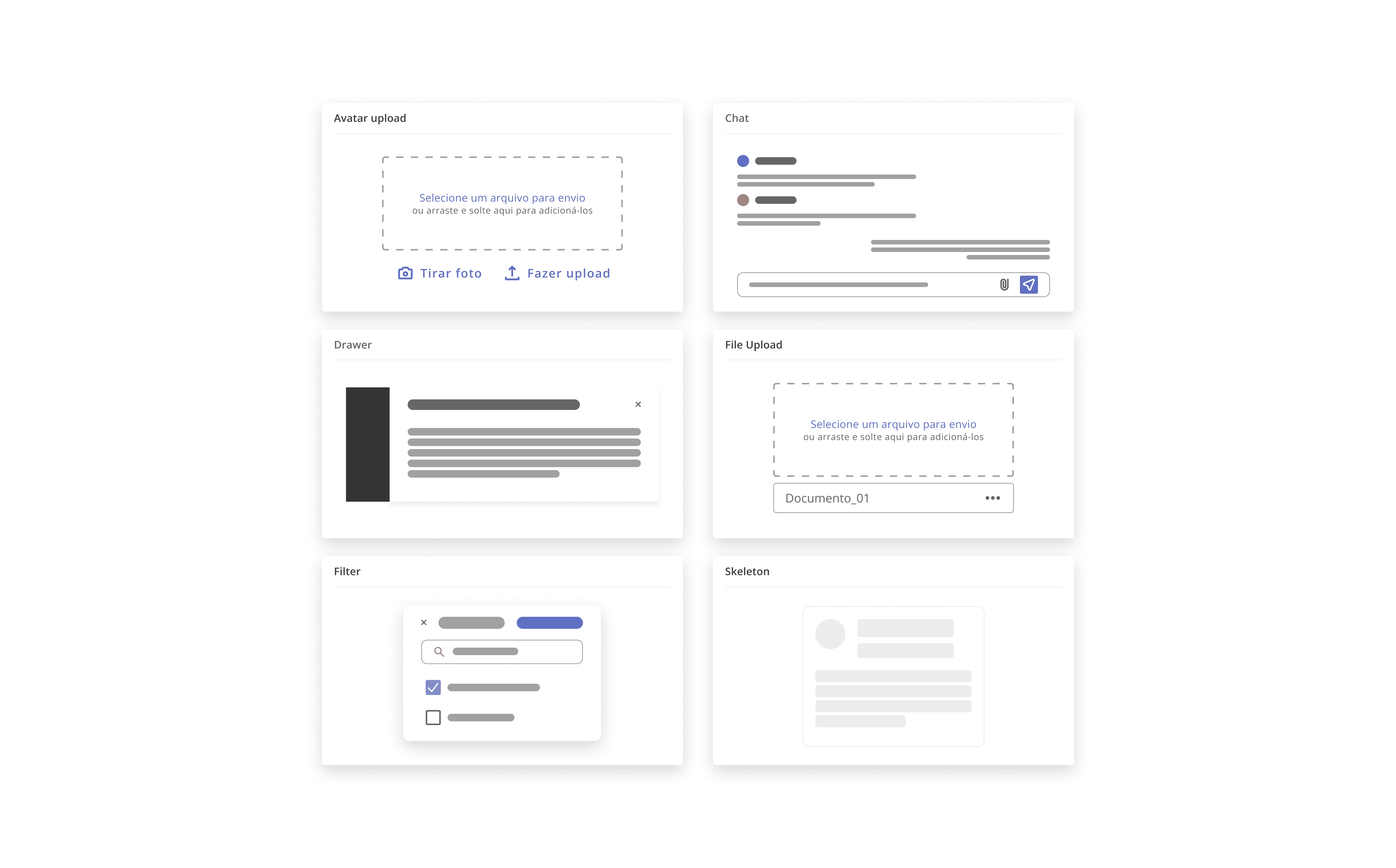
The components

Three levels of complexity

The components were organized into layers: basic pieces with a single function, combinations that resolve more complex actions, and patterns that structure entire flows by reusing everything that came before.

The components were organized into layers: basic pieces with a single function, combinations that resolve more complex actions, and patterns that structure entire flows by reusing everything that came before.

Components

Simple

Components

Simple

They serve as a foundation for more complex components and have specific functions.

They serve as a foundation for more complex components and have specific functions.

Simple components created

Simple components created

Components

Compounds

Components

Compounds

Created from one or more components, they are used for more complex actions.

Created from one or more components, they are used for more complex actions.

Compound components created

Compound components created

Components

Patterns

Components

Patterns

They have a complex structure and typically use other library elements.

They have a complex structure and typically use other library elements.

Created patterns

Created patterns

Tokens

Design Tokens

Design Tokens help scale and minimize design decisions, they are responsible for ensuring style consistency. Today we separate them into Global Tokens (those common to all brands), Brand Tokens (what we use to differentiate brands and create new themes).

Design Tokens help scale and minimize design decisions, they are responsible for ensuring style consistency. Today we separate them into Global Tokens (those common to all brands), Brand Tokens (what we use to differentiate brands and create new themes).

Example of the token change in the Date Picker component.

Example of the token change in the Date Picker component.

Component states serve as feedback to the user about the actions that are happening. One of the goals of the Design System is to standardize states so that, regardless of the component, the characteristics remain similar in their variations.

Thinking of a way to make the team's work (Design and Tech) as aligned as possible, a guideline for color styling was established, in order to make the components consistent with each other within the DS.

Component states serve as feedback to the user about the actions that are happening. One of the goals of the Design System is to standardize states so that, regardless of the component, the characteristics remain similar in their variations.

Thinking of a way to make the team's work (Design and Tech) as aligned as possible, a guideline for color styling was established, in order to make the components consistent with each other within the DS.

Screen size changes.

Screen size changes.

Make the base components, declare the tokens in the code of each variant, and change the style sheets/token libraries according to each company/theme. All clients use the same component library and each has the freedom to create variations, but they use different token libraries (style sheets).

Make the base components, declare the tokens in the code of each variant, and change the style sheets/token libraries according to each company/theme. All clients use the same component library and each has the freedom to create variations, but they use different token libraries (style sheets).

Brief demonstration of the styling.

Brief demonstration of the styling.

Validations

Test the system as if it were a product

For initial validation, we ran usability testing with three designers, including two stakeholders on the project and one designer tester. The task was to build a login screen and a form using only design system components.

[Talk about how the test went]

For initial validation, we ran usability testing with three designers, including two stakeholders on the project and one designer tester. The task was to build a login screen and a form using only design system components.

[Talk about how the test went]

Project limitations and usability system with designers

Creating styles, Figma was not so up to date

Lack of metrics, Design System materials, accessibility validation with real users

The team still lacked metrics in the process to analyze the impact of the DS; the subject was recent, and there was no time or space to validate with real users, relying solely on bibliographies.

Usability testing with designers

For the initial validation of the Design System, usability tests were conducted with two interested designers and one who was not involved in the process. The instructions were: to create a login screen and a form using only components from the Design System.

Partial results

After delivering the first version, it was handed over to the teams for use, and we moved on to the second version, where we improved the components in both code and design.

Project limitations and usability system with designers

Creating styles, Figma was not so up to date

Lack of metrics, Design System materials, accessibility validation with real users

The team still lacked metrics in the process to analyze the impact of the DS; the subject was recent, and there was no time or space to validate with real users, relying solely on bibliographies.

Usability testing with designers

For the initial validation of the Design System, usability tests were conducted with two interested designers and one who was not involved in the process. The instructions were: to create a login screen and a form using only components from the Design System.

Partial results

After delivering the first version, it was handed over to the teams for use, and we moved on to the second version, where we improved the components in both code and design.